Made from the lowest resolution stuff on earth
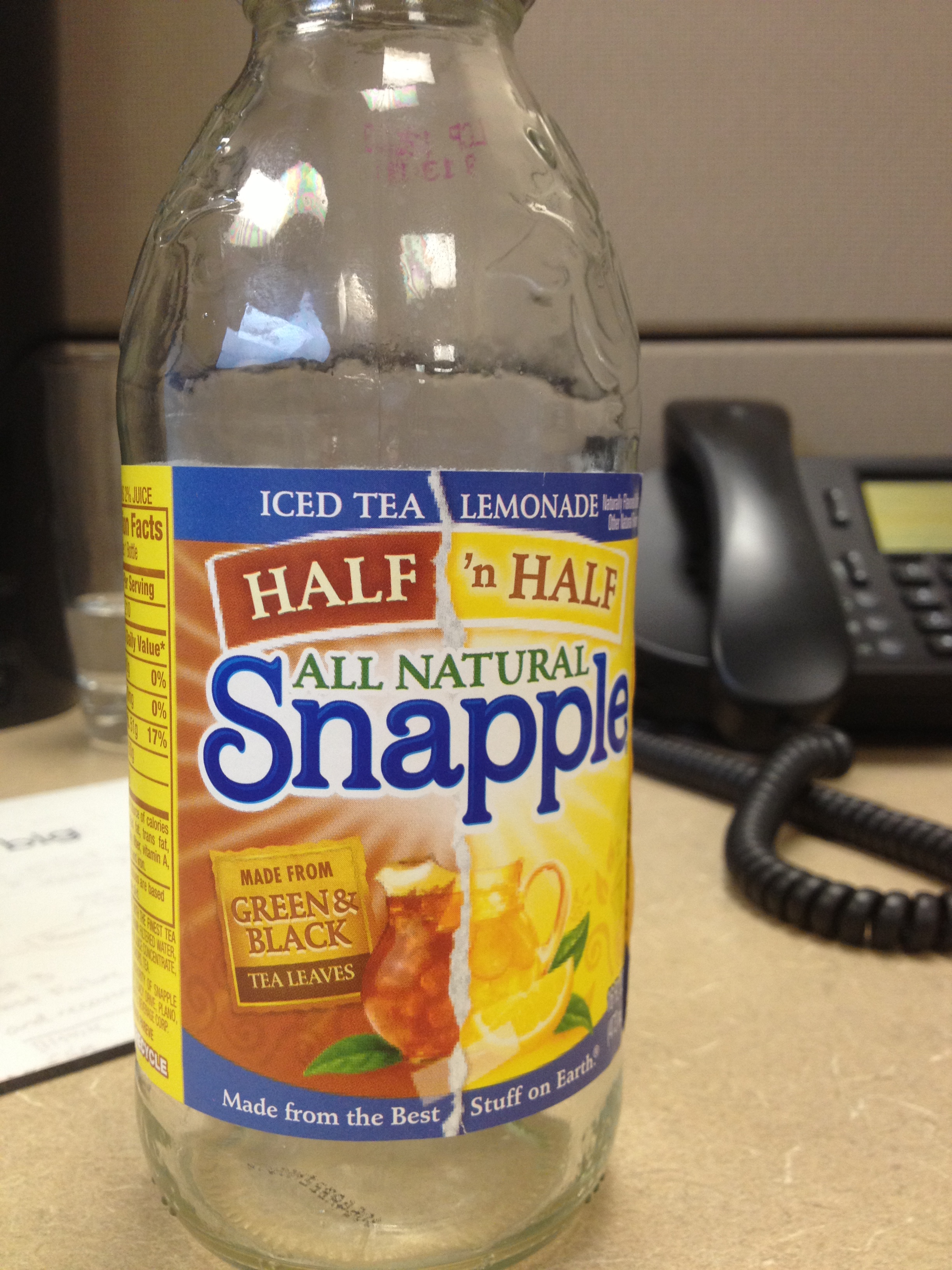
So there I was on my lunch break enjoying a nice Snapple Half & Half Iced Tea & Lemonade. Suddenly my eye catches it...
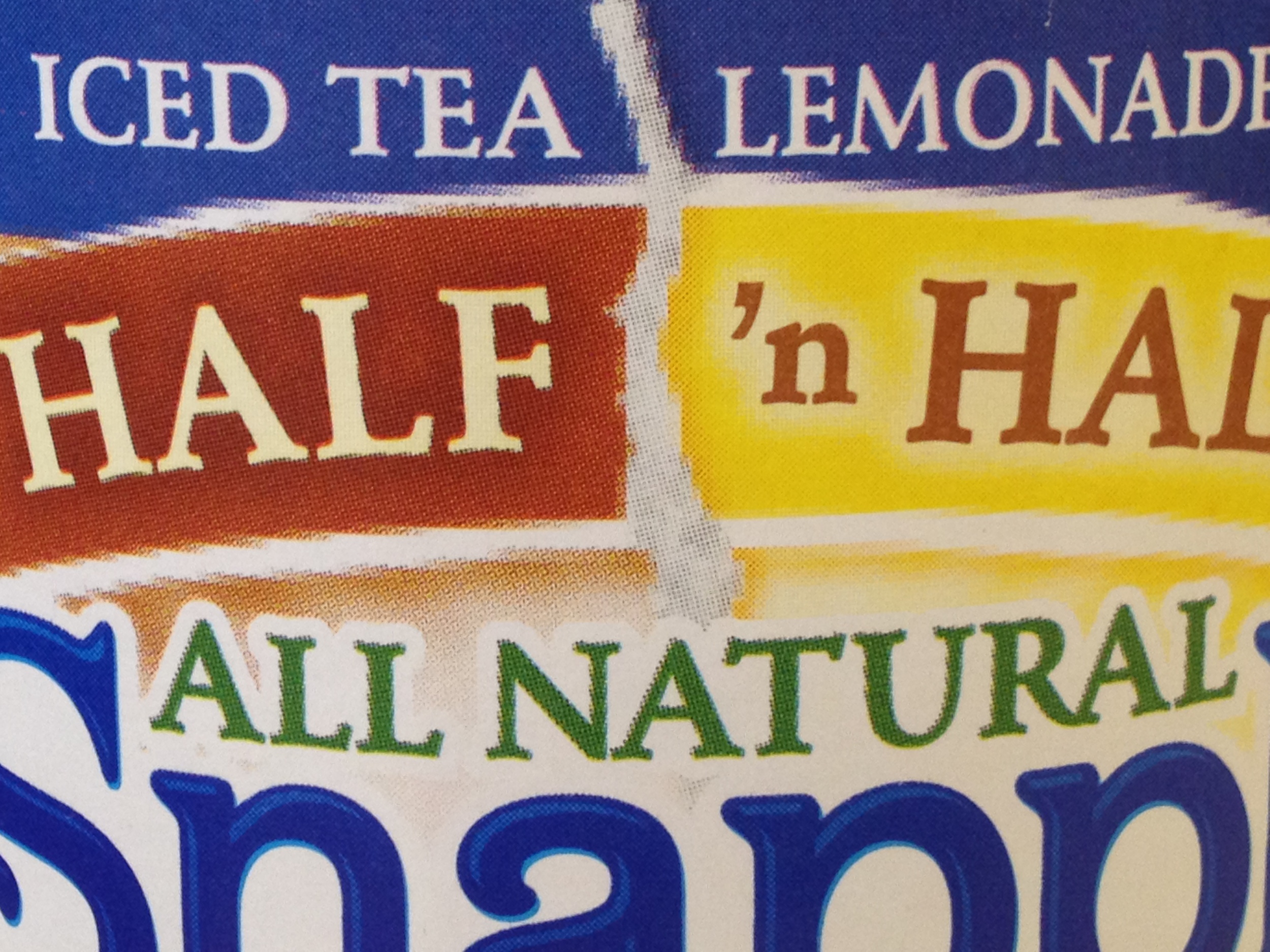
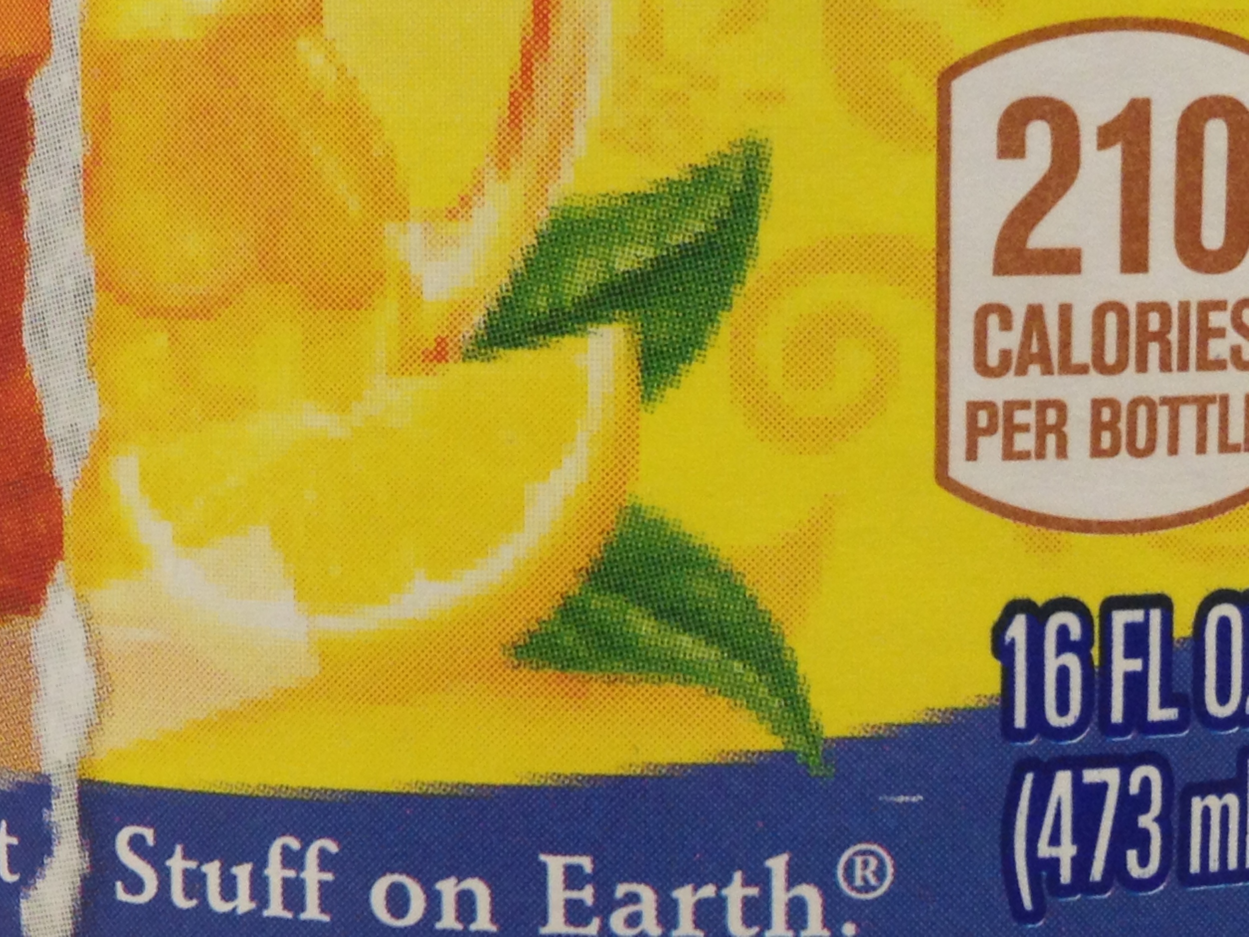
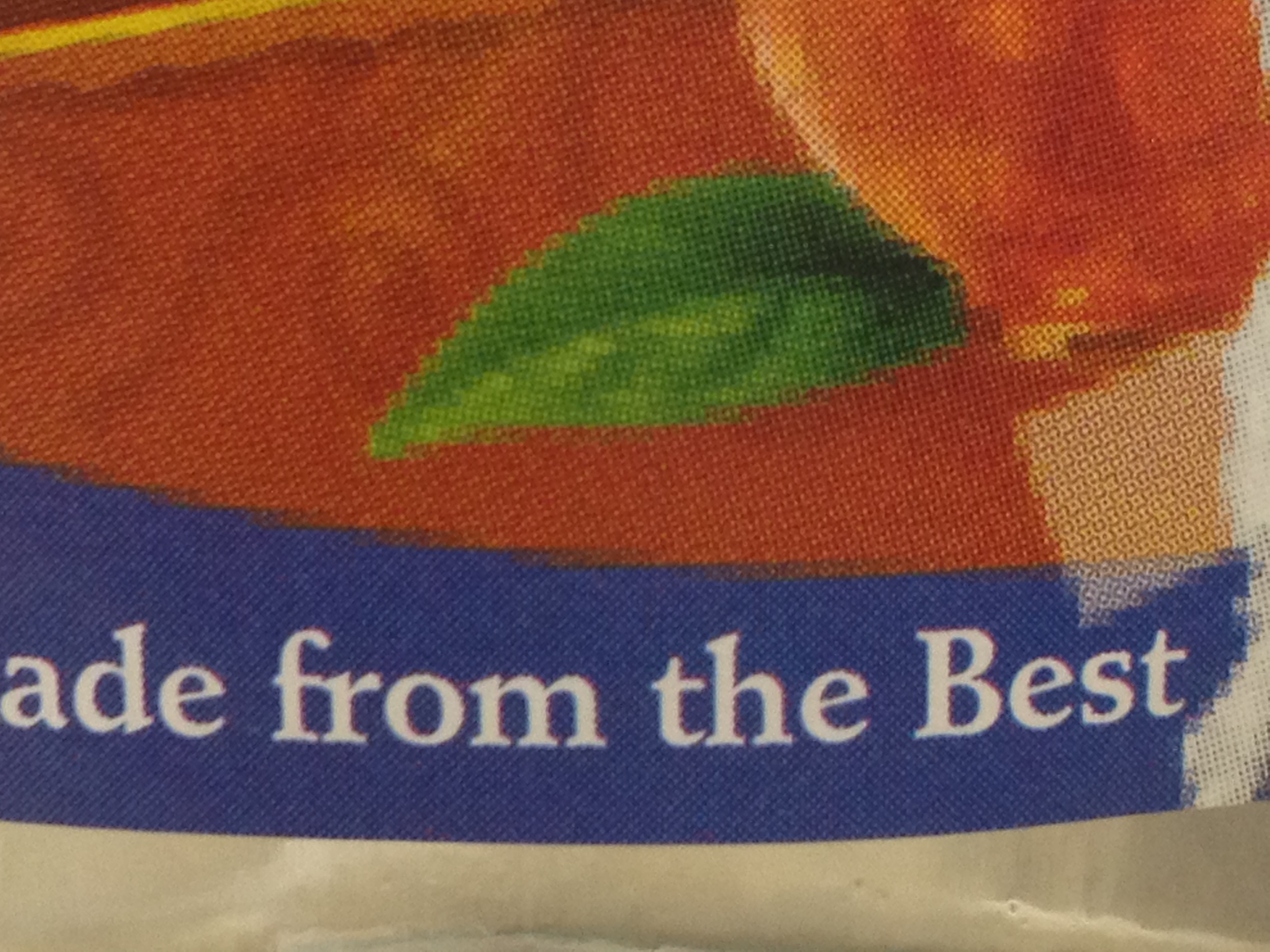
The eternal foe of the graphic designer...
Low resolution!
The interesting part is that the Snapple logo was perfectly crisp and all the lettering across the top and bottom looked great. The nutrition facts looked like they should too. The graphics behind the logo were where the problem was.
Here's a few photos I grabbed on my phone. I tried to shoot the problem areas next to areas that looked normal.
So I have to ask: What the hell, Snapple?! Can we chalk this up to something as simple as a proofing error? Or is this the work of some renegade graphic designer?! Have I won something? DID I FIND THE GOLDEN TICKET LOW RES BOTTLE?!